How to Combine COT Data with Supply & Demand Analysis
Mar 8, 2026
How to Combine COT Data with Supply & Demand Analysis
COT positioning alone is incomplete. Supply and demand fundamentals alone are incomplete. Used together, they produce a more reliable picture of where a market is headed — and more importantly, they help you avoid the most common mistake in commodity trading: being technically right but fundamentally wrong.
This article explains how two data sources can be used together for market analysis. It does not constitute investment advice. All trading carries risk.
What Each Data Source Actually Tells You
COT data (Commitment of Traders) shows who is holding positions and how large those positions are. The most useful segment is Managed Money — these are commodity hedge funds and CTAs. When they are heavily positioned in one direction, that tells you market sentiment. It does not tell you whether that sentiment is justified.
Supply and demand data (USDA WASDE) shows why prices should move. The key metric is the stocks-to-use ratio (S/U): ending stocks divided by total use, expressed as a percentage. A low S/U means tight supply — prices tend to be elevated. A high S/U means abundant supply — prices tend to be depressed.
Neither source alone gives you a complete picture. COT tells you the crowd. Fundamentals tell you whether the crowd is right.
The Four Combinations That Matter
When you overlay COT positioning against S/U ratio, four scenarios emerge. Each has a different risk/reward profile.
1. Funds Long + Tight Supply (S/U Low)
Fundamentals support the positioning. The rally has a reason. This is the cleanest setup — funds are long because supply is tight, and the data backs them up. Less contrarian signal, more confirmation.
What to watch: How much of the fundamental story is already priced in? Check whether S/U is still deteriorating or has stabilised.
2. Funds Long + Loose Supply (S/U High)
This is the most dangerous combination. Funds are heavily long, but the fundamental picture does not support elevated prices. The positioning is driven by momentum, narrative, or macro factors — not by actual supply tightness. When the narrative breaks, the unwind can be sharp.
Historical example: This pattern appeared in several soft commodity markets during 2022 when financial inflows drove prices well above what supply/demand justified.
3. Funds Short + Tight Supply (S/U Low)
Funds are positioned bearishly, but inventories are actually shrinking. This is a classic setup for a short squeeze. The trigger is usually a demand shock (unexpected Chinese buying, for example) or a weather event that confirms the supply concern.
Historical example: Corn in late 2020. Funds were heavily short. China began buying US corn aggressively. S/U was already tightening. The subsequent rally was over 70%.
4. Funds Short + Loose Supply (S/U High)
Fundamentals support the bearish positioning. Abundant supply, fund selling — the fundamental picture aligns with the bearish positioning. Markets can remain depressed for extended periods in this condition.
Screenshot: The Combined View on cotdata.uk
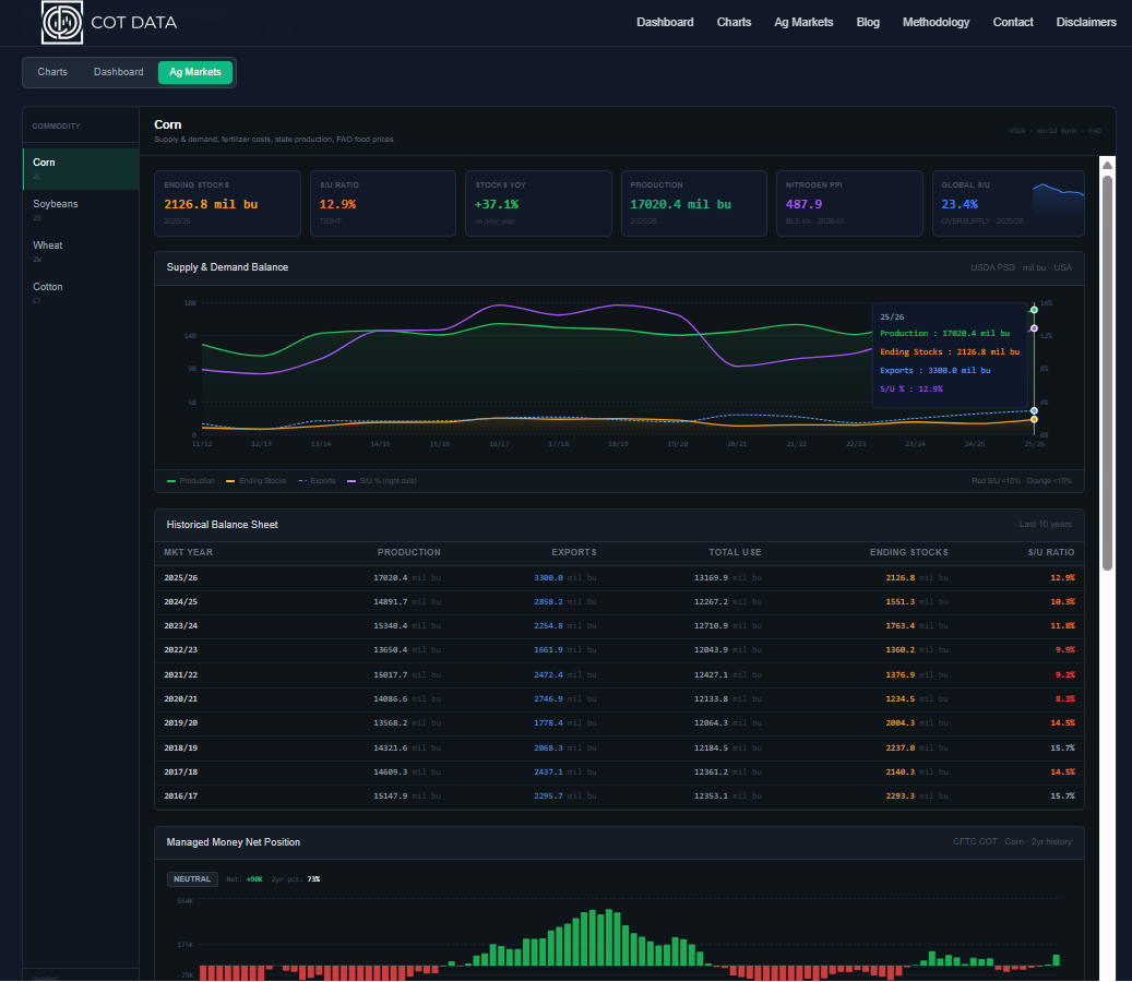
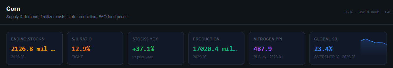
The screenshot above shows the current state for corn on the Ag Markets dashboard. The S/U ratio (top metric cards) and the Managed Money net position (bottom chart) are on the same page. This is the comparison you want to make every time you review a grain market.
How to Read the S/U Ratio Card
The dashboard shows two S/U ratio cards: one for the US and one for Global. Both use three colour tiers — Red (Tight), Slate (Balanced), Green (Heavy) — but the thresholds are different for every commodity. Using the same numbers across crops produces false signals.
Why Thresholds Differ by Crop
Each commodity has a different baseline for what "tight" actually means, driven by how it is stored, how quickly it spoils, whether it is food or feed, and how much China holds in strategic reserves.
Soybeans are a just-in-time export crop — the US pipeline runs very lean, so 8% is already comfortable. Wheat goes directly into human food, so governments stockpile it aggressively to prevent civil unrest, meaning a 30% ratio that would be a glut for corn is actually relatively thin for wheat. Cotton doesn't rot and can be warehoused for years, so global ratios routinely sit above 60% without that being unusual.
US S/U Thresholds
| Commodity | 🔴 Red — Tight | ⬜ Slate — Balanced | 🟢 Green — Heavy |
|---|---|---|---|
| Corn | below 10% | 10–15% | above 15% |
| Soybeans | below 8% | 8–12% | above 12% |
| Wheat | below 30% | 30–45% | above 45% |
| Cotton | below 20% | 20–30% | above 30% |
Global S/U Thresholds
Global ratios run higher than US ratios because of Chinese state stockpiles. China routinely holds 60–70% of the entire world's corn inventory, and similarly outsized reserves in cotton. That grain and cotton is locked in state warehouses and not freely traded on the export market — it inflates the headline global figure without reflecting actual exportable supply.
| Commodity | 🔴 Red — Tight | ⬜ Slate — Balanced | 🟢 Green — Heavy |
|---|---|---|---|
| Corn | below 24% | 24–28% | above 28% |
| Soybeans | below 18% | 18–22% | above 22% |
| Wheat | below 28% | 28–35% | above 35% |
| Cotton | below 60% | 60–75% | above 75% |
The global cotton threshold of 60% is not a typo — it reflects the reality of Chinese textile reserve policy. A global cotton S/U of 55% is genuinely tight; 70% is normal.
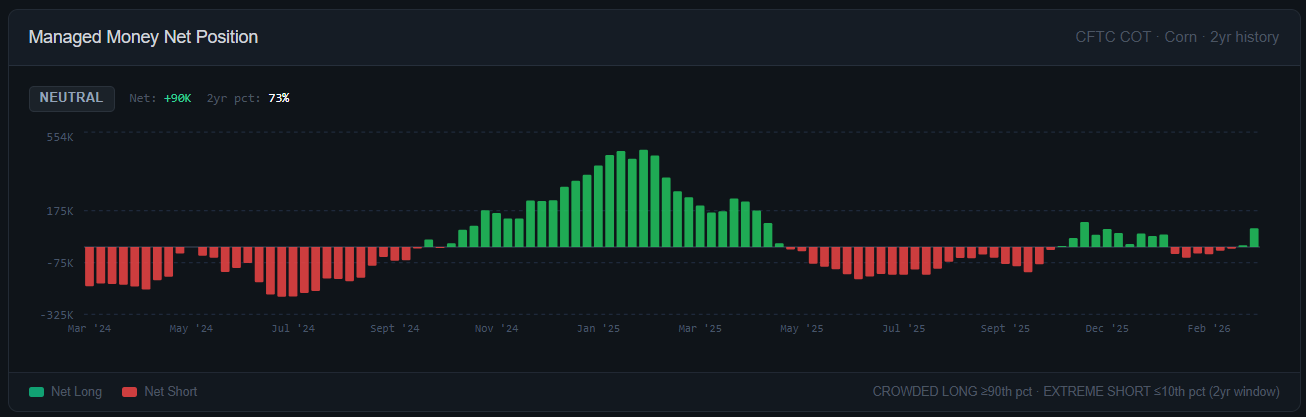
How to Read the COT Position Chart
The COT chart shows the net position of Managed Money (large speculative funds) over a rolling 2-year window. Two threshold lines are shown:
- Upper red band — 90th percentile of 2-year range. Positioning is historically extreme long. Labelled "CROWDED LONG."
- Lower green band — 10th percentile of 2-year range. Positioning is historically extreme short. Labelled "EXTREME SHORT."
An extreme reading does not mean the market reverses immediately. It means the risk profile shifts. A crowded long market is vulnerable to a fast selloff on any negative news — even news that would normally cause only a moderate reaction.
A Practical Workflow
When reviewing a grain market, work through this sequence:
- Check S/U ratio. Is supply tight, balanced, or abundant? What direction is it trending?
- Check fund positioning. Are Managed Money funds extreme long, extreme short, or neutral?
- Identify the combination. Does the positioning match the fundamentals, or is there a divergence?
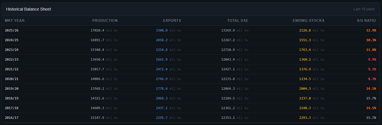
- Check historical balance sheet. Is the current S/U deteriorating or improving? A tightening trend carries different weight than a one-year outlier.
- Apply a catalyst filter. Fundamental and positioning setups do not move markets on their own. They define the conditions. A weather event, WASDE revision, or large buyer (China) is usually the trigger.
What the WASDE Report Adds
The USDA WASDE report is published monthly, around the 10th of each month. Each release updates the supply and demand estimates — and the market reacts immediately, because the revision can shift the S/U ratio meaningfully.
The most important revisions to watch:
- Production estimate changes — especially the August report, which is the first survey-based estimate of the US corn and soybean crops.
- Export revisions — large increases in export demand tighten the balance sheet quickly.
- Ending stocks revision — a downward revision to ending stocks when funds are already short is a condition worth monitoring closely.
The Ag Markets section on this site shows how estimates have changed month-to-month. Compare the current month's figures against three months ago to see the direction of revisions.
Limitations of This Approach
This is a framework for analysis, not a mechanical signal.
- COT data is reported with a three-day lag. The Tuesday positions are published on Friday. In a fast-moving market, positioning can change significantly in that window.
- S/U ratio is an average. It masks regional differences, quality variations, and seasonal timing.
- Fund positioning is correlated across commodities. A macro deleveraging event (equity selloff, dollar spike) can unwind grain longs regardless of fundamentals.
- The WASDE is an estimate. It has been revised significantly in subsequent months, especially early in the crop year.
Use this approach to identify the conditions that favour a move — not to predict the exact timing.
Summary
The combination of COT data and supply/demand fundamentals answers two questions at once: what is the crowd doing, and is the crowd right. When they diverge — funds heavily positioned in one direction while fundamentals point the other way — that is worth paying close attention to.
The data is on this site — COT positioning and supply/demand fundamentals on the same page, for corn, soybeans, wheat, and cotton. No subscription required.
Data sources: CFTC Commitment of Traders report (weekly). USDA WASDE supply and demand estimates (monthly). This page uses the NASS API but is not endorsed or certified by NASS. All data is provided for informational purposes. This is not investment advice.